STUDY® / DESIGN
OLD G® TO NEW G®
Why the G changed, and what didn’t.
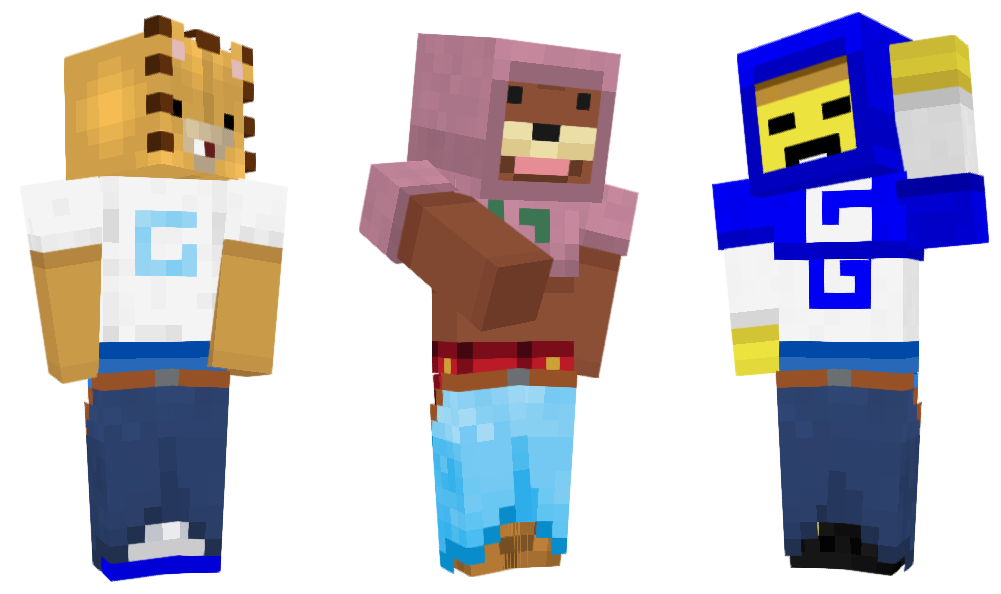
The G started in Minecraft. Before it was ever on a shirt, it was on our builds: a huge, square G on the side of a GOOD® building. We were deep into brutalism at the time, and we wanted something monolithic, a mark that looked like it had been carved out of a single block.
Gen 0
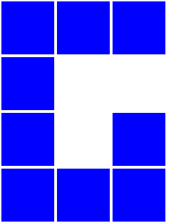
The first G on the first shirt was a lot narrower. Three pixels wide and four tall, sitting a pixel left of centre on an eight-pixel chest. It said GOOD®, but it was a little off balance, and you could feel it every time you looked at the shirt.
Gen 1
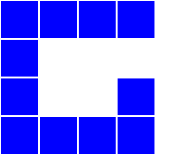
So we turned it into Gen 1. A little more square, a little stronger, and centred. Closed off and very brutalist. When you put the whole shirt together it read as one solid block, which was exactly what we were after.
Gen 1 is the G on SHIRT® I, CROPPIE® I and DOUBBIE® I, and on the BABY® pieces that were made in that generation.
The new G
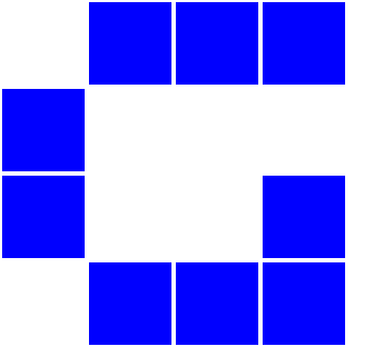
The new G is open and minimal. We stripped away everything that wasn’t necessary. The corners are gone, and what is left is the cleanest G we can make without it looking ambiguous.
Designing for a 64 by 64 skin shaped it, on Classic arms and on Slim. The old G felt too big. It was a neon sign. If GOOD® is going to be something you can just put on without worrying about looking like a billboard, it has to be normal. Timeless. A fixture in your life.
A lot of what we chase when we make these things is the ubiquitous: something so common it folds into everyday life, timeless, and still unique enough to stand out. The new G is still a big logo, but it sits cleaner on the fabric. You will notice that on some pieces it goes quiet: off to the side, down in a corner, even blending into the fabric.
A lot of what we chase is the ubiquitous: something so common it folds into everyday life.
It first showed up on the GOODIE®. We had been experimenting with a different G, and when we made the new GOODIE® we made the switch. The reception was mixed at first, but good overall. From there it went to the G-KNIT®, the BABY TEE®, the CARDIE®, all of AMONG THE TREES® and SHIRT® II.
For the logo fans
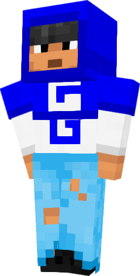
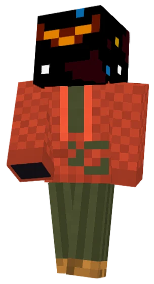
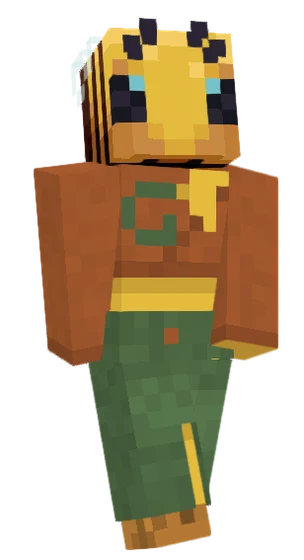
Some people love the G, and we love that. The idea of stacking logos came from a conversation on another designer’s Discord. He used to make Roblox items, and he told us some people really loved his asterisk logo; he was thinking about a piece with more than one. That is where the DOUBBIE® came from. The CROPPIE® and DOUBBIE® are for the people who want the logo front and centre, and as many of them as possible.
What doesn’t change
The design. We will never put something out that we haven’t given the most intimate thought to. We go through a lot of iterations and a lot of changes, and we will always take the utmost consideration before releasing anything.
The originals stay, too. SHIRT® I, CROPPIE® I and DOUBBIE® I are some of our most unique pieces, and they keep the heritage of the OG G.
If the new G could say one thing, it would be: put me on and let’s go, wherever you’ve got to go. Maybe someone on a server sees your skin, no armour on, and asks where you got it. Maybe someone who has been rocking GOOD® since Gen 1 spots the new G on another server. That would be amazing.
Comments